
It’s fairly easy to compile a list of wack albums with wack covers to match, mainly because the list starts and finishes with this…

… As an alternative, I wondered if it was possible to throw a list together of dope albums with shitty covers. Can the 2 co-exist? For starters, I’m gonna forego the whole pen and pixel movement. This is due to the fact that:
a. They’re easy targets
b. There wasn’t exactly an abundance of dope albums to come out of it, save for a few indie gems that only people who live in a 10 mile radius of the artist’s local swapmeet and trendy ‘omg-look-what-I-found’ revitalist types still really care for.
c. Master P. Just, because.
It should go without saying that anything art-based is completely open to interpretation and perception. However, regardless of the great music on some of the following recordings, the covers still need to get put in check.
10. Eric B and Rakim - Dont Sweat the Technique

As Eric B and Rakim’s musical relationship began to fizzle out, so did the creativity of MCA’s Art Department. If 1987 was born-gawd Gucci prints and thick gold ropes, then ’92 was all about jazzy crayola styles, disjointed sentences and gnarly cut, paste and flip poses. AND it all takes place in front of... a white-room. Somehow, this is Arrested Development’s fault.
9. Eightball and MJG – On Top of the World

It’s arguably not as good as their debut effort, Comin’ Out Hard, but dammit, this album cover is genius. Eightball and MJG are on top of the world. They’ve just discovered Rick Moranis’ device from Honey, I Shrunk the Kids and have decided to raid Suave House Records CEO Tony Draper’s Micro Machines collection and race them across his pool table while he’s playing. What scamps. The album being ill more than makes up for it though.
8. Dogg Pound - Dogg Food

The East Coast-West Coast media-fueled conflict is boiling over thanks to the “New York, New York” video-shoot, C. Delores Tucker has managed to whip almost every soccer mom, conservative do-gooder and attention-starved female R&B washout into a frenzy and… this is what you come up with? Leather jackets and neon yellow writing? DANGEROUS. Kurupt’s smooth “hmm, I wonder” pose makes the cover that much more intimidating. Where’s Joe Cooley and Rodney-O when you need them?
7. AZ – Pieces of a Man

There are at least 3 “hmm, I wonder” facial expressions here, surely that’s worth something? Not to mention that they all seem to be randomly dispersed throughout the cover. There is absolutely no point to this artwork, which is a shame because the album is dope. I still don’t get why it never did well. Likeable rapper + popular cameos with Monifah and D’Angelo + beats by Trackmasters, RZA and Dr. Dre + collabo with Nas = sophomore slump, mediocre sales and being dropped from your record label? Yup, gotta be the album cover.
6. Luniz - Operation Stackola

Stackola means cash, and the Luniz are robbing a bank to get some. Unfortunately, this means scaling the walls of a MS Paint-drawn skyscraper to get it. Is it any wonder that the both of them look a little confused? Rather than getting an artistic representation of one of the west coasts finest pimped-out, gangsta rap and quintessential summer albums, they instead end up looking like 2 extras from Who Framed Roger Rabbit. Shockingly enough, AZ’s label (Noo Trybe) was behind this mess too.
5. Canibus - Can-I-Bus

Yo gawd, shit is ultra-violet cause the shit is mad scientific nah mean? And… the letter is gold and platinum cause the style is mad royal, dig? In translatable terms, it basically means that Universal’s marketing department didn’t have the slightest clue of how to market a rapper that made Rich Boy look like he ain’t just run a 110m sprint in a 100m gym. No degenerative lyrics about guns, women and cocaine? Fuck! Throw a purple background and a giant C on there instead! No, he didn’t end up becoming the second coming of Rakim, but this album is mad solid and shouldn’t be slept on. And besides, isn’t ragging on Canibus for the sake-of sooo 2003? Well, clearly not.
4. Cam'ron - Confessions of Fire

A mini-controversy erupted towards the end of 1997 due to the proposed artwork of Cam’ron’s Confessions of Fire. According to magazine advertisements, the cover would feature Killa Cam holding a crucifix (or was it a Bible?) in one hand and a gun in the other. The artwork was supposed to represent Cam’s good intentions, but ultimate attraction to ‘the streets.’ Rather than run the risk of releasing an album with a cover that actually meant something, Sony/Epic Records instead decided to revamp it and depict Cam’ron as the lost member of the Village People. It wouldn’t be the last time Cam sought after those Queer Community spending dollars:

3. Big Pun - Capital Punishment

For all intents and purposes this shouldn’t even be on the list. It’s pretty much just Pun’s head and those fruity goggles that were all the rage in New York during the late 90s. However, after I realized that this had replaced the much doper cover artwork that seems to only be available on the European releases it pretty much became a concrete lock.

How can you NOT use some chick (who I always assumed to be his wife) dusted in gold, posing as a hip-hop Statue of Liberty with a mic and turntable? AND Pun has his chubby, meat hooks on her desperately trying to cover up her nipples with some shield while posing. This shit had ‘one take’ classic written all over it. But no, clearly this was no match for THE GOGGLES, or some dick at the label who was afraid that HMV might not display the album as prevalently with the crude artwork involved. They let Europe win. And the terrorists too.
2. Boogie Down Productions - Ghetto Music: The Blueprint of Hip Hop
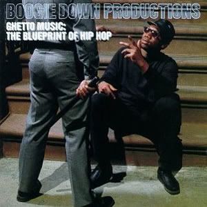
How do you follow up the previous classic Boogie Down Productions covers of the duo arming themselves for war in the darkened basement on Criminal Minded and Kris imitating Malcolm X with the Uzi by the window with By All Means Necessary? By showing a close-up of a cop’s ass in tight pants. You say I’m pushin’ crack, but you be doin’ that! I’ve always wondered what the cop’s problem with Kris chillin’ on the stoop was anyway. He probably spells Kulcha with a C, causing the Hip Hop Temple veil to split while Tupac and Biggie murder kittens from heaven, or something.
1. Dr Dre - The Chronic
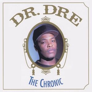
Yes, I’m well aware that the cover art is based on Zig-Zag’s classic white paper packs:
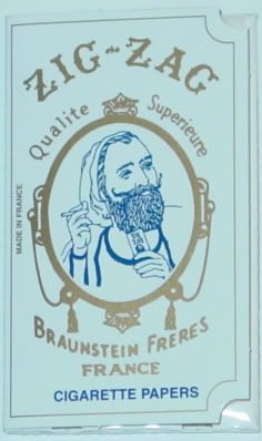
No, that doesn’t make it any better. 15 years ago, this album redefined an entire genre. 15 years later, the album cover is still pants. Brown pants. With stains.
4 comments:
this is a great blog man Big Bear is hilarious
pretty on-point minus the chronic, dogg pound and BDP albums. I like those covers actually.
That Boggie Down one isn't so bad. It looks kinda like an old vinyl jacket cover for some soundtrack by Bobby Womack...
When I noticed you listed one of KRS One's album cover, I got ready to flame you (a la an Ayatollah follower emailing Salman Rushdie). That was until I read your bit and did notice the close-up of a cop’s ass in tight pants.
Touché sir! Now if you'll excuse me, I need to dispose of this vomit.
Post a Comment